Simpler metrics, smarter visuals: improving the results matrix
By Gatis Narvaiss, Director of Product at Edurio

Written by Gatis Narvaiss, Director of Product at Edurio
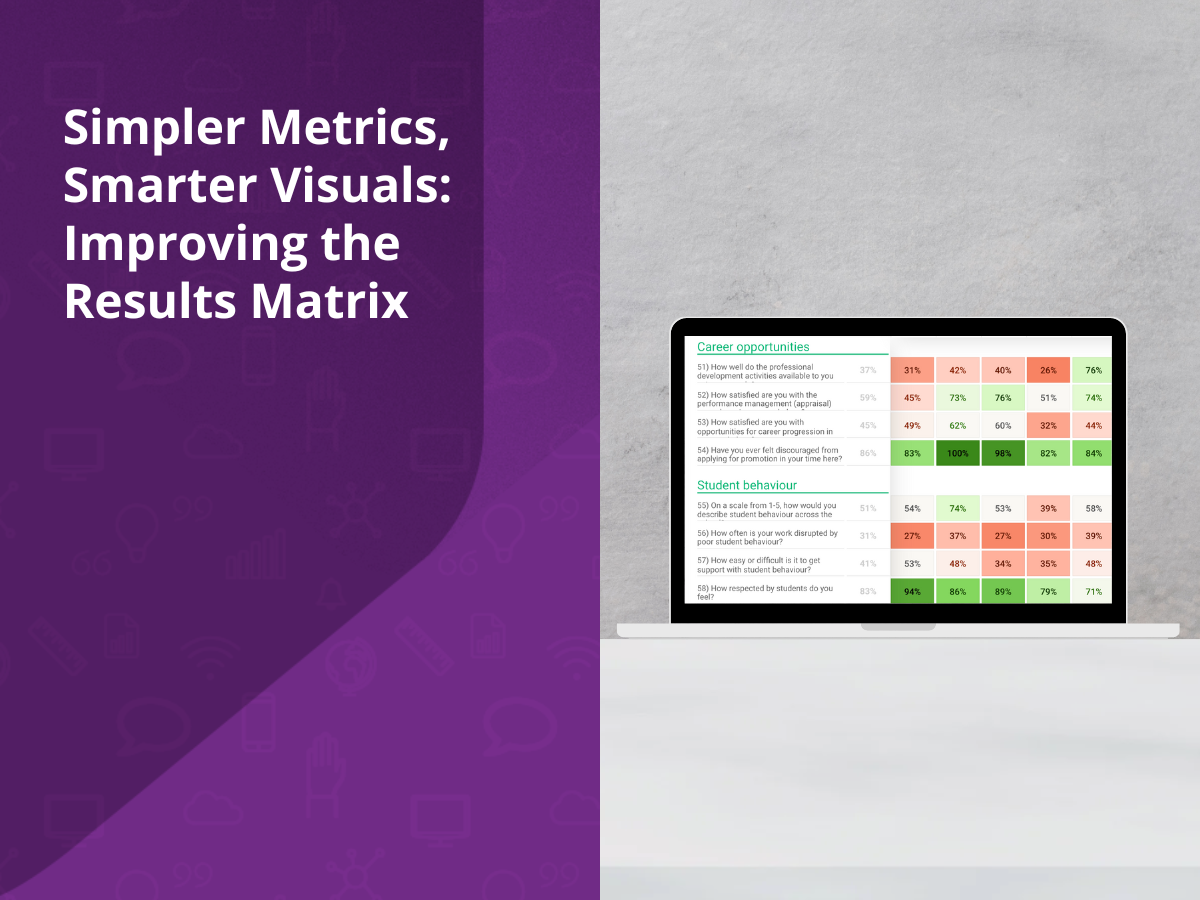
The results matrix, or heatmap, is an essential part of Edurio’s platform. It offers a unique way to analyse your survey data and is a key tool in identifying trends and outliers.
Based on user feedback and drawing on Edurio’s extensive dataset – built over several years and comprising industry-leading respondent volumes – we have updated how results are displayed. This post outlines what’s changed and how these updates support clearer, more actionable insights.
What are the benefits of the results matrix?
Our results matrix is designed to:
1. Spot outliers at a glance – The matrix helps you instantly identify areas that stand out, whether results are notably high or low. Think of this as a screening tool, not the final stage of analysis. It helps you form hypotheses and identify where further investigation is needed.
2. Add depth to the Executive Summary – While the Executive Summary provides a concise overview of your survey results, the matrix reveals the nuances and individual outliers across all questions and respondent groups.
3. Uncover patterns and clusters – The matrix reveals patterns and clusters across questions, modules, school or respondent groups. Quickly find interesting patterns – whether that’s consistently low results for one module, or an individual cell that stands out from its surroundings.
What’s changing and why?
Making positive percentages the standard
We’re now using positive percentages as the primary way to display results across the platform – including in the results matrix. Positive percentages refer to the proportion of respondents who choose the responses above the midpoint of the scale – for example the top two answer options on a 5-point scale.
Why the shift? Because our users told us it’s what they prefer. Positive percentages are intuitive, more easily understood, and clearer to communicate with stakeholders. There’s no longer a need to explain what a 3.4 on a 5-point average scale actually means – a 0% to 100% scale is much easier to interpret.
It also provides greater clarity. A score of 3.4 might reflect a combination of strong positives and strong negatives. Positive percentages, on the other hand, tell you exactly what proportion of respondents felt positively.
More meaningful colour gradients
Previously, the matrix colour scale was based on averages, with red for low scores, yellow for mid, and green for high. But this wasn’t working for many of our clients. Results that were good and excellent often looked the same. For schools with consistently strong scores, the matrix became less meaningful.
Here’s what we’ve done:
– Through a data-led approach, analysing all the responses from the last 2 years, we found that the median school-level positive percentage hovers around 65%.
– Based on this, we’ve built a wider visual ‘middle zone’ of 50% – 70% into the colour scale – to reflect a zone where more than half the respondents answered positively, yet the results hover around or even below the benchmark. This dual-purpose range highlights the nuance in mid-range performance.
– Results between 70% and 100% now appear in increasingly rich greens, helping them stand out more clearly.
This change doesn’t just make the matrix more useful for identifying areas requiring further investigation and action – it now helps highlight exceptional success too.
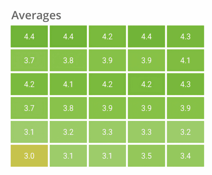 Before the change
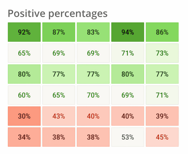 After the change
A standardised visual scale
Consistency matters, so we’ve applied this updated colour scale across the entire platform. Whether you’re looking at the executive summary, diving into a specific question, or scanning the matrix, you’ll see the same percentage in the same colour.
We have also smoothed out the colour transitions, so you no longer get sharp shifts for minor result differences – just a clean, readable gradient that accurately reflects the change.
![]()
What does this mean for your results?
You may notice some changes in how your matrix appears – for example, areas that previously showed as green might now appear more neutral. This doesn’t mean your results have worsened.
In fact, the updated colour scale reflects what many of you have already told us – that being around the benchmark doesn’t always feel like ‘green’, but also isn’t something to worry about. By aligning more closely with how users already interpret results, the new visuals highlight areas of true excellence whilst still allowing for nuance in the middle range. It’s a more accurate reflection of your data – helping you identify what’s going well and where your efforts can have the most impact.
Accessibility improvements
We’ve taken steps forward to enhance the accessibility of the results matrix:
- Heavier font weight improves legibility in the matrix’s compact view
- Improved colour contrast ensures readability for users with colour vision deficiencies or those using greyscale displays.
- Our new design complies with WCAG 2.0 guidelines.
Want to learn more?
For a deeper look at what’s behind these changes, including how we set the new colour scale, read our Help Centre article linked here.
We’d love your feedback
If you have feedback, ideas, or stories about these changes – or any other features you’d like to see from us – do let your Customer Success Manager know, as we’d love to hear them!